GrizSpace iPhone App
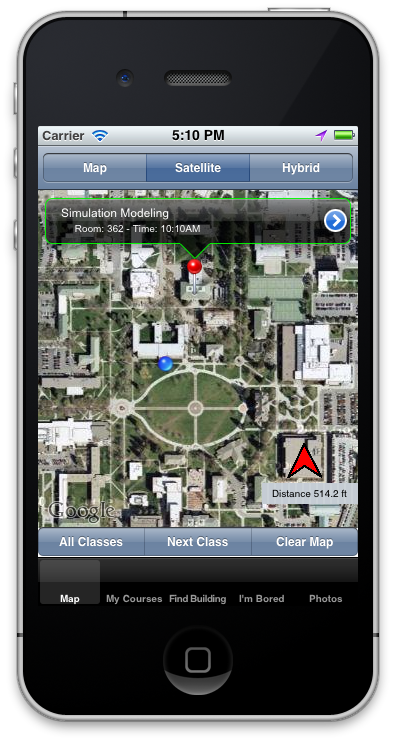
Screenshot of the map view in GrizSpace. This shows the user’s position (blue orb), their destination (red pin), and the direction they need to head in (red arrow).

Screenshot of the user’s schedule view.
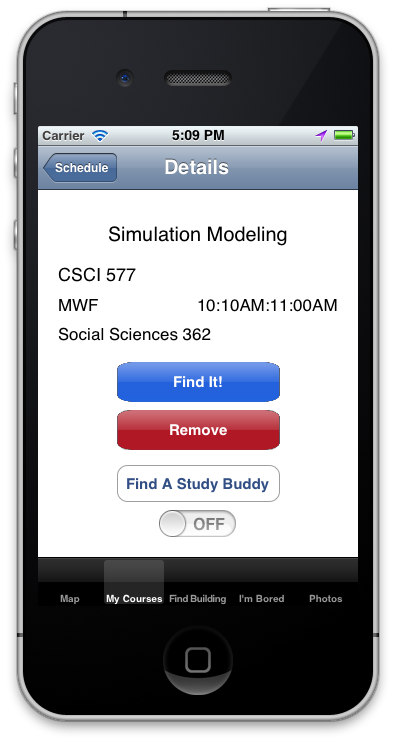
Screenshot of a course’s detailed view. From this screen, users could locate the class on a map, remove it from their schedule, or find someone from this class to study with.
Background
GrizSpace is an iPhone application for scheduling and finding classes on the University of Montana campus.
What was the assignment?
In Spring 2012, Human-Computer Interaction and Mobile Development were co-linked, so in HCI, we were tasked with designing a product from low-fidelity sketches to high-fidelity mockups and eventually to implementation. Simultaneously, in Mobile Development, we implemented our designs and incorporated user feedback into a functioning iPhone application.
GrizSpace was developed by Kevin Scott, Will Lyon, Jaylene Naylor, and me.
What am I most proud of?
This was my first successful team-project in school. We were able to coalesce our initial lo-fi brainstorm sketches into one uniform product design. At each higher fidelity iteration, we incorporated user-centered design principles, which resulted in a much stronger and more usable product. For example, we hadn’t anticipated users would like to add classes by tapping the weekday instead of using the convenient (and obvious to us) plus button.
What did I learn from the project?
The biggest takeaway from this project is not that I learned Objective-C or that I learned how to automate most of our usability reports with Ruby and HTML 5, it’s that I learned how to incorporate user-centered design into all of my workflow, whether it’s designing a website or building a command-line interface. While I haven’t had time to apply more formal evaluation methods like cognitive walkthrough, heuristic evaluation, or real user testing in my day job, the principles still resonate with me. It’s similar to how I write a sentence, striving to be as concise as possible.
I also gained valuable experience working in a tight-knit group of stakeholders. We probably would have taken this to a product had we not tired of writing about GrizSpace in so many reports.
What was my role?
All of us had equal roles in usability testing, but my other roles in the project included:
- Tools expert: I helped set everyone up with Git for version control, debugged GitHub issues and Xcode integration, resolved merge conflicts, documented methods for pushing and pulling, and established best practices (e.g., descriptive commit messages and minimal merge commits).
- Data munger/designer (partial): I built Ruby scripts to parse course listings we scraped from Cyberbear into our database. I normalized our database and modified our schema as needed. Additionally, most of our iteration postmortem reports consisted of enormous listings of screenshots and associated text, so I wrote Ruby scripts to automatically generate readable (and usable!) PDFs.
- Architect (partial): I designed the original class diagram that for our final project. Midway through, we needed to add more features to get more experience with real-user testing, so we didn’t create formal plans for those new features.
What would I do differently?
While we had great usability testing coverage, we faltered on automated unit testing of our code, which led to many otherwise preventable bugs. Improving our code-coverage is a must for future versions.
Additionally, if this were a real project, I would work with UM to get a clean data export, as parsing Cyberbear’s HTML output ate a ton of time.