Enron Email Corpus Visualization
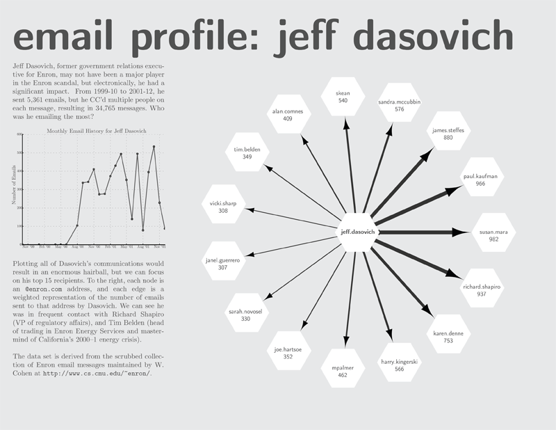
Thumbnail of a poster investigating the email trends of Jeff Dasovich.
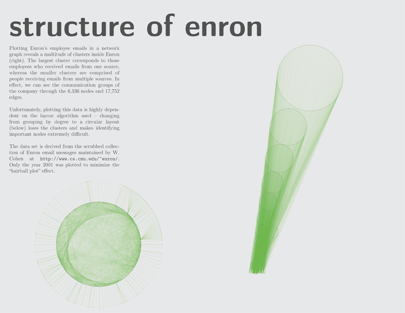
Thumbnail of a poster showing the clusters (based on communication) of Enron.
What was the assignment?
In Data Visualization, we were tasked with visualizing networks. I chose the Enron email corpus because it was huge (2.5 GB of email — 517,440 messages). While exploring the data set, I stumbled across an address that had sent over 34,000 emails — Jeff Dasovich’s address. This was one part I investigated with the poster above. The second part was examining whether clusters would be present in Enron’s communication, also shown in the poster above.
What am I most proud of?
This class was an opportunity to be creative in a visual medium for once, so I am most proud of getting to exercise that creativity to produce meaningful graphics summarizing large amounts of data.
What did I learn from the project?
- How to identify hypotheses in opaque data sets, and how to support them with visualization.
- How to process large amounts of plain text effectively (shard, shard, shard!)
What would I do differently?
The network graph is flawed because it the data is bound to the layout algorithm, and it requires manual tweaking to get something half-digestible. An approach I didn’t have time to explore was using a hiveplot, which is a new approach to visualizing large, complex networks.